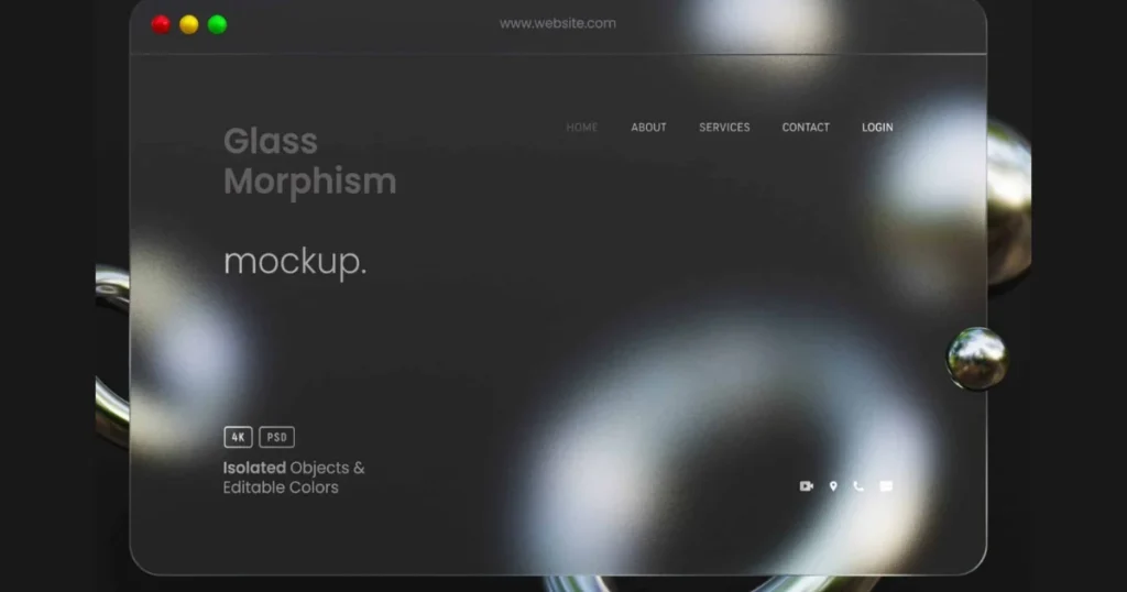
The web is moving away from flat, lifeless interfaces. As digital experiences become more immersive, developers and designers are looking for ways to add depth, hierarchy, and a futuristic feel to their layouts without cluttering the viewport.
Enter Glassmorphism—the design trend defined by frosted-glass effects, translucent layers, and vivid background glows. But is it just a passing visual fad, or does it serve a functional purpose in modern Web Architecture?
Why Glassmorphism is More Than Just Eye Candy
When implemented correctly, glassmorphism isn’t just about looking “futuristic.” It solves a critical UI challenge: maintaining visual hierarchy in dark-themed interfaces.
- Layering without Bulk: Translucent panels allow users to maintain context of the background while focusing on foreground interactive elements.
- Micro-Interactions: Glass elements naturally react to hover states and light shadows, creating intuitive visual cues for users.
- Content Isolation: It perfectly highlights high-priority blocks (like CTAs or pricing tiers) by separating them from the standard layout depth.
The Dark Side: Performance & Accessibility Risks
While the frosted-glass aesthetic looks premium, a poorly optimized implementation can destroy your website’s performance and alienate users. As a web developer, you must balance the aesthetic with core technical principles:
1. The CSS Paint Storm (Performance Lag)
To achieve the frosted look, browsers rely heavily on the backdrop-filter: blur() property. This forces the browser’s rendering engine to constantly recalculate pixels underneath the glass layer during scrolling. If you stack too many glass elements, your mobile page speeds and Core Web Vitals will take a massive hit.
2. The Contrast Constraint (Accessibility)
White text over a semi-transparent, light-blurred background often fails WCAG accessibility guidelines. If your background image or color shifts, your text readability drops to zero.
How to Implement Glassmorphism Safely in WordPress
You don’t have to sacrifice your page load speeds for a premium aesthetic. Here is the technical approach we recommend for clean web architecture:
- Limit the Blur Layers: Use glassmorphism exclusively for high-impact zones—like your main Hero Card or navigation bars—rather than every content block.
- Enforce Solid Fallbacks: Always use a solid background color fallback for older browsers that do not support backdrop filters.
- Strict Text Contrast: Ensure that any text placed inside a glass panel has a stark, high-contrast drop shadow or a slightly darker overlay opacity beneath it to guarantee absolute readability.
Conclusion: A Tool for Intuitive Data Architecture
Glassmorphism is a powerful tool in a developer’s arsenal, provided it serves the content, not just the eyes. By blending translucent UI elements with heavily optimized asset management, you can build interfaces that feel light, modern, and exceptionally fast.